An alphabet with no official font file, a typeface designed so a strip of tape cannot turn a P into an R, and the federal manual behind every American road sign.
Road signs in the United States use the FHWA Series fonts, known as Highway Gothic, whose use is fixed by the federal Manual on Uniform Traffic Control Devices. German number plates use FE-Schrift, a forgery-impeding typeface mandatory since November 2000, and many other countries have adopted either typeface.
Change a P to an R on an old German number plate and all you needed was a strip of black tape. A typeface built to defeat exactly that trick now sits on plates in dozens of countries, while a very different government alphabet covers road signs from Arizona to New Zealand. Both exist for the same reason: letters that a driver or a machine can read quickly and correctly.
What is Highway Gothic and who made it?
Highway Gothic is the unofficial name for the alphabet series that America's Federal Highway Administration (FHWA) formally calls Standard Alphabets for Traffic Control Devices. Officially they are the FHWA Series fonts, a sans-serif family. The letterforms are meant to stay legible at long distances to drivers moving at road speeds.
The alphabets were first published in 1948 and reprinted in 1952, with changes in 1966, 1977 and 2000. The system has seven fonts, running from narrow to wide strokes: Series A through F 2000, plus a modified Series E. The 2000 edition altered a few letter shapes and added lowercase letters to every series.
Work began in the Second World War at the Public Roads Administration, the body that became the FHWA. Draft versions appeared in 1942 on signs along the Pentagon road network.
A freeway-signing research programme run by the California Department of Transportation followed in 1949 and 1950. It produced Series E Modified, a thicker version of Series E designed to take button reflectors on ground-mounted signs, and a lowercase alphabet so that overhead signs lit from outside could carry mixed-case wording. Those lowercase letters, paired with Series E Modified, became the national standard for freeway guide signs through the 1958 Interstate signing manual.
Not every series survived. In the United States Series A is officially retired, because its legibility at high speed is poor, though New Zealand still specifies it for certain signs. The first set was uppercase only, apart from Series E(M), the font used on big expressway and freeway guide signs. In 2004 the FHWA published lowercase for every typeface and changed the manual to permit it.
Despite its reach, there is no official digital font. Individuals and companies have built their own from the published shapes, and Roadgeek 2014 is an open-source reproduction.
One alphabet was drawn for readers moving at road speed; the other was drawn so that a strip of tape could not change what a plate said.
Which series goes on which American sign?
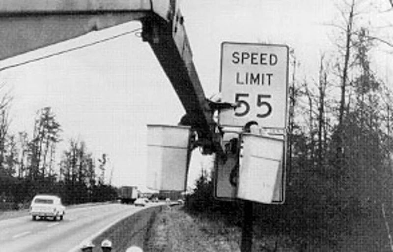
Numbers on one- and two-digit Interstate, US Highway and state route shields use Series D. Three-digit routes either switch to the narrower Series B or C or shrink the Series D numerals. Series E and F are the usual choice for speed limit signs, and freeway guide signs use Series E(M).
Street name signs normally show white lettering in Series B, C or D over green, though blue or brown can stand in, and the wording may be all capitals or mixed case. Regulatory signs on white, construction signs on orange and warning signs on yellow carry black lettering instead.
Local choices vary. Georgia used both Series C and D on Interstate signs until 2012. In 2016 Arizona moved to mixed-case Series E on freeway guide signs, mixed-case Series D for guide signs away from freeways, and Series C in mixed case for street names.
What happened to Clearview, the rival road-sign typeface?
Clearview was designed specifically for traffic signs, and for years many expected it to replace the FHWA series on new signs. In 2016 the FHWA rescinded its 2004 interim approval. Existing Clearview signs could remain, but new signs had to return to Highway Gothic.
A bill to reinstate the approval was introduced in the House of Representatives in June 2016, and it became law inside the 2018 Consolidated Appropriations Act. The FHWA describes Clearview as completely optional and neither required nor recommended. Indonesia, which had used the older typeface from 1993, brought in Clearview by regulation in 2014.
Which other countries use Highway Gothic?
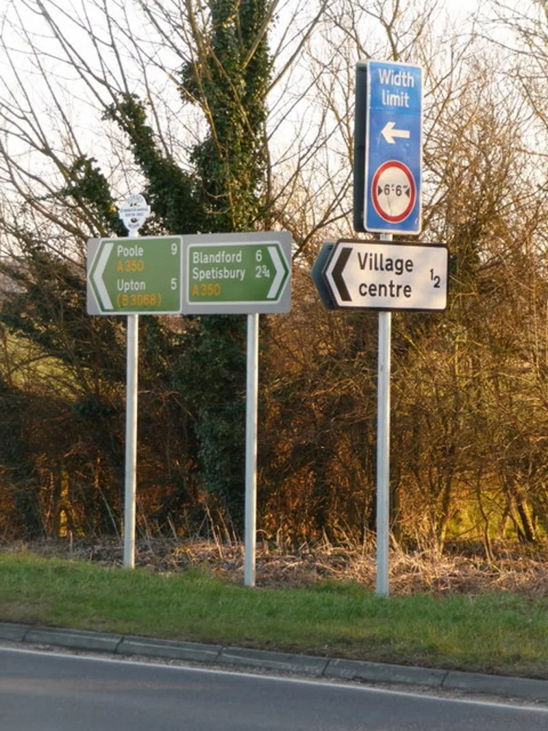
Many do. Australia's road-sign standard, AS 1744:2015, is a metric rendering of the FHWA Series 2000 alphabets, and it thanks the FHWA for help in developing it. Canada uses the typefaces predominantly. Ontario kept an in-house version until the late 1980s that had flat-topped 3s and 1s without a serif, and Windsor began replacing Helvetica signs with Highway Gothic in 2018.
Elsewhere the typeface appears in Peru, New Zealand, Indonesia and Malaysia, and derived or near-identical alphabets turn up in SICA countries, Brazil, Colombia, the Philippines, Thailand and Turkey. Mexico did so until 2023, when it adopted its own original typeface.
Some places mix it with other fonts. Mainland China pairs it with Helvetica Bold for letters and numbers, Taiwan uses Arial Bold alongside Series E for English, and India reserves it for highway shields, using Transport on road signs. Portugal's Rodoviaria variant served from the 1970s until a new signage model arrived in 1994-1998 and still appears on Portuguese text in Macau. Saudi Arabia used variants before 2023, when Transport replaced them.
The Netherlands built its own derivative, designed by the ANWB and the highways and waterways authority. The original set pairs a wide RWS-Ee, based on Series E(M), with a narrow RWS-Cc. Since 2015 new signs there use RWS-Ee and a fresh RWS-Dd based on Series D.
The look also escaped the roadside. In the mid-1990s Tobias Frere-Jones of Font Bureau drew a multi-weight print face from the FHWA letters, released as Interstate. NBC used it for NBC Sports graphics from 1997 to 2006, TV Guide uses it on its covers, and the Weather Channel relied on it for maps and local forecasts.
What is the MUTCD and who has to follow it?
The Manual on Uniform Traffic Control Devices is the FHWA's rulebook for the look, installation and use of signs, road markings and signals. Federal law demands compliance on every road open to public travel, privately owned ones included, though parking lots and gated communities are exempt. The current release is the 11th edition, from December 2023.
The MUTCD fixes the content and placement of signs. Exact dimensions, colours and fonts sit in a companion book titled Standard Highway Signs and Markings. States can write their own manuals but must substantially conform to the federal one, and a national advisory committee counsels the FHWA on changes.
The United States has not ratified the Vienna Convention of 1968 on road signs. The first MUTCD was published in 1935, 33 years earlier, and it differs significantly from the European-influenced convention. An attempt to adopt several of the convention's standards in the 1970s left many American drivers confused.
How did the MUTCD come about?
In the early days of the rural highway, private automobile clubs promoted and maintained each road, and each road had its own signs, designed to advertise the route rather than guide travellers. Rival clubs sometimes put up as many as eleven sets on the same highway.
Road-surveying groups in Indiana, Minnesota and Wisconsin started the push for standards in the late 1910s and early 1920s. In 1922 the Mississippi Valley Association of Highway Departments adopted their sign shapes: a circle for railroad crossings, an octagon for a stop, a diamond for ordinary danger, a square for intermittent danger and a rectangle for rules and directions.
Thomas Harris MacDonald, who headed the federal Bureau of Public Roads, wrote in January 1925 that uniform markings, signs and a uniform colour code were essential, because drivers in an emergency must react on reflex. Two manuals followed, one for rural roads in 1927 and one for urban streets in 1930. In 1931 the two organisations formed a Joint Committee, and the MUTCD was its product.
The first edition of 1935 was a mimeographed document, retyped as a typeset edition in 1937. The Institute of Traffic Engineers joined the committee in 1942, and the wartime edition covered blackout conditions and saving materials. The 1948 edition changed the format, settled the long argument over centre-line colours by making them white and recommended yellow for double centre lines and no-passing zones. A 1954 revision changed the stop sign from yellow to red.
How did federal law make the MUTCD binding?
The 1966 Highway Safety Act required every state to create a highway safety programme by 31 December 1968 and to follow uniform standards set by the Department of Transportation. Non-compliance cost 10% of federal highway-aid funding. The Department simply adopted the whole MUTCD by reference, turning a quasi-official project into an official one.
States can add to the manual but must stay in substantial conformance and adopt FHWA changes within two years. Campaigning helped: in a July 1965 essay in The Atlantic Monthly, Senator Abraham Ribicoff argued that differing state standards contributed to road deaths, citing Pennsylvania, where signs alone marked no-passing zones, and Georgia, which painted a yellow line on the shoulder.
The 1961 edition made yellow centre lines mandatory for double lines and no-passing zones and covered road-works signs for the first time. The 1971 edition required yellow centre lines on all two-way roads, white lines between same-direction lanes, white-on-green for all highway guide signs and orange for work zones. Most repainting happened between 1971 and 1974, with a deadline of 1978.
Why did the United States skip the worldwide road-sign scheme?
A 1949 UN conference began research on a uniform sign scheme, and in 1951 experiments in the United States tested signs from six countries for legibility, on roads near Columbus, Charlottesville, Minneapolis and in New York. In 1953 the US declined to sign the proposed protocol, citing state control of roads and the rapid innovation needed for new high-speed highways.
The experiments still led to the Vienna Convention of 1968. France, Chile, Turkey, India and Southern Rhodesia installed MUTCD signs in return. By September 1951 the experts favoured the American proposals for stop, cross road, curve and intersection signs, but they struggled to agree symbols for narrow road, bumpy surface and steep hill.
The 1971 MUTCD leaned towards symbols over words, a preference championed by FHWA official Robert Conner, who thought symbols worked better where reaction time mattered. Some Vienna signs worked. The red Yield sign replaced the earlier yellow one, and the Do Not Enter sign, given a square backing and words, replaced a word-only version. Others flopped. The lane-drop symbol looked to drivers like a big milk bottle and was ridiculed as the Rain Ahead sign, and a two-children symbol needed a School Xing plaque. The 1978 edition dropped the preference.
The 2000 edition was the first available online and the first in metric units. The 2003 edition mostly corrected errata. The tenth edition arrived in 2009, with revisions in 2012, and was the first to cover private property.
What is FE-Schrift and why was it designed?
FE-Schrift, short for the German word meaning forgery-impeding typeface, is a monospaced sans-serif face for number plates. Its letters and numbers are deliberately a little disproportionate, so alterations show and machines can read the plate. It was developed in West Germany and has been mandatory on German plates since November 2000.
The need arose in the late 1970s, during Red Army Faction terrorism, when investigators found that the then-standard DIN 1451 font was easy to doctor. A little black paint or tape could turn a P into an R or B, a 3 into an 8, or an L or F into an E. An FE plate is harder to alter because it also needs white paint, which stands out at night against the retroreflective white background.
Karlgeorg Hoefer of the Federal Highway Institute created the design. Tests at the University of Giessen from 1978 to 1980 led to tweaks, including replacing the slashed zero, which looked like an 8, with a zero carrying a small white slash in the upper right corner. DIN spacing was proportional, whereas FE spaces letters and numbers differently.
Terrorism was not the only reason. Plate theft had spiked in the early 1970s, and the first priority in the scope document was readability for both people and machines, in the same decade that produced the OCR-A and OCR-B typefaces. Forgery came second. The project ran from the 1977 scope document to a 1982 decision not to adopt the design, and it ended up in a drawer.
How did FE-Schrift finally reach German plates?
After the Iron Curtain fell, plate theft spiked again, with stolen cars moved to Eastern Europe. Officials looking for a fix found the finished FE-Schrift, a good match for automatic number-plate recognition. Some eastern states introduced it in 1994, and it became national law in January 1995.
That timing matched the first Schengen borders opening. The 1998 extension of the Schengen zone brought EU-wide acceptance of the Euro plate, which removed the old requirement for an extra country-code plate abroad. On 1 November 2000 the old plate design was dropped and the old typeface with it. Older plates stay valid, historic cars can get new plates in the DIN typeface, and the armed forces generally still issue DIN plates.
The three legal sizes of German plate lettering
| Variant | Letter height | Letter width | Digit width |
|---|---|---|---|
| Normal script (Mittelschrift) | 75 mm | 47.5 mm | 44.5 mm |
| Narrow script (Engschrift) | 75 mm | 40.5 mm | 38.5 mm |
| Small script (verkleinerte Mittelschrift) | 49 mm | 31 mm | 29 mm |
Which countries use FE-Schrift on their plates?
Dozens, in a spread that runs from Germany outward. The narrow script lets a standard Euro plate carry nine characters, and German law includes umlaut vowels because they appear in county codes. The typeface is defined in the vehicle admission ordinance; no digital version is published, though third-party versions such as Euro Plate can be downloaded.
In South America, Mercosur members agreed in October 2014 on a common plate of 400 mm by 130 mm using the narrow FE-Schrift for a seven-element code, with a blue strip carrying the emblem and flag. A test at the INTI found it resisted alteration better than the Brazilian script. The plan was for 2016, but the actual introduction came in 2018. Brazil has used it since September 2018, starting in Rio de Janeiro, and Uruguay was ahead of the others, with a four-digit scheme in Montevideo in 2002.
Africa's early adoption followed proposals from the German firm Utsch AG, which had developed retroreflective plates for Germany and could supply embossing machines already in mass production in 1994 and 1995. South Africa changed its numbering and plate design in 1994 and introduced the typeface then; its blank plates carry a certification mark that now includes a QR code. In other regions owners also receive a window sticker that cannot be removed intact, and some recent versions hold an RFID chip. Namibia followed in 1994, Zambia in 2000 and Kenya in 2022.
Elsewhere, Cyprus and Georgia adopted it on 3 June 2013, Moldova on 1 April 2015 and Bosnia and Herzegovina in 2009. Sri Lanka began in August 2000 with a variation developed by a German company. Peru, Chile and the Philippines are among others, and Malaysia has used it since September 2024 for electric vehicles only. In Australia, personalised Euro-style plates use FE-Schrift in New South Wales, since 2002, and Victoria, since 2005. Latvia is an odd case, using it only on tractors and trailers and keeping DIN 1451 for cars.
What do these typefaces mean for drivers?
On American roads, the letter style tells you what a sign is for: Series E(M) on freeway guides, Series D on route numbers and white lettering on green for streets. The MUTCD fixes the look, and the same rules apply on privately owned roads open to the public. On a German plate, the odd spacing is the point: tape and paint stand out, and cameras read it easily.
What is changing for these typefaces?
Clearview is optional again after the 2018 law, though the FHWA neither requires nor recommends it. The MUTCD's 11th edition, released in December 2023, is the current release. FE-Schrift keeps spreading: Malaysia began with electric vehicles in September 2024, and Indonesia extended the typeface to motorcycles in 2025.